BLOGGER TEMPLATES AND TWITTER BACKGROUNDS
Showing posts with label Digipack:. Show all posts

Monday, 28 November 2011

Final Front Cover:


Located above is the front cover that both Khushel and I decided would be the most appropriate and eye catching front cover for our digipack album. The colours gradually bring out the image of the artist without looking too washed out. However, there are far too many dark patches on the face of the artist so these will be smoothed out. To change this I decided to duplicate the original image in order to enhance the artists face and to create a presence within the video. I used the clone tool in order to match the facial skin tone to the dark patches on the digipack cover.


I also changed the font in order to keep it within the theme of calligraphy, this led to the positioning and resizing of the text in order to enhances the artist. I researched previous digipack albums, looking specifiically at whether the artists name was bigger than the album name. I found out that this was the case in most of the R&B genre album covers.

Final Inside Panel:

We came to the decision that after using the spotlight effect and incorporating the plain black background effect onto our first inside panel we realised that there was still something missing from it and it definitely looked far to plain and boring. There wasn't anything to it and for me it didn't engange or grab my attention. I decided to dispose of the black background idea and inport a multi coloured background onto the back of the panel before adding a black background on top of this, as a cover.

I then used one of the large paint splash effect and brush to make marks in the black backdrop allowing the bright colours behind this to come through. After we contrasted and blended the mix of colours together both Khushel and I agreed that this panel looked a lot better and undoubtedly more professional as it looked increasingly fun, animated and exciting which again, matched with the style of our digipack.


Newer Text Image for inside panel:

After receiving some feedback from our peers, we were told that the bright colours that were used as shadowed effects on top of our text looked to messy and bright, as if they'd just been put there for the sake of it. They also said that the bright colours made it quite hard to read the text as well and stopped the text from appearing as the main focus point on the panel which was what it was meant to appear as.

So, Khushel and I decided to use one of the paint brushes to erase some of the colour out of the text so that it only appeared towards the bottom of it. We agreed that after removing some of the colour it clearly made this panel look more effective, vibrant and professional whilst still showcasing the style of our digipack. The step by step of how I fixed this panel and the feedback I recieved from my peers is displayed below.


Feedback:

- It's less colourful, it's not too in your face now compared to before which makes the image a lot better. (Feedback given by male aged 17.)

- The one before was too full on and you couldn't read the writing, and the focus was mainly on the colour before rather than the writing, which wasn't good because it was the writing we wanted to see. 
By diluting the colour it definitely makes the panel more interesting and appealing. Good panel. (Feedback given by male aged 18.)

- By diluting the colour the background is more noticeable which is good. I like the yellow in the middle and it's definitely better than the old one because the colours are faded out. Looks a lot more professional. (Feedback given by male aged 17)


Possible inside panel for digipack:

After creating both of the sections for our second inside panel for our digipack we decided to fit the panel to size so that it would fit the measurements for our DVD digipack album. We also wanted to be able to see what the overall panel would look like by attaching both of the sections of the panel together. Presented below is the step by step for how we attached both sections of the panel together along with the feedback we recieved from our peers.


Feedback:

- I like the design, the font and the background. I like the black and white. I don't like the purple, green, blue background colours looks a bit childlike. Perhaps, darken the colours more. But I like the background and font of it. (Feedback given by male aged 17)

- Both pictures look good in a unique way but together maybe not so good. Can't really see the text. (Feedback given by male aged 17.)

- I don't like the whole rainbow thing on the top half of the panel. Picture of the hat has been saturated a bit to much. I like the attention to detail with the hat and the covering of the eyes and with the hand holding the hat. (Feedback given by male aged 17)

However, after reviewing all of the feedback given from our peers, we decided to change the background and the colour of our text as the white background was far too contrasting with the rest of our panels. Moreover, after placing the two sections for the second panel of our digipack together, both Khushel and I realised that the panels didn't match up very well together, as one panel was dark with bright neon colours painted across half of it, whilst the other was coloured white with a very bright, high contrasted photograph in the centre.

For us, we realised that it didn't look professional or sleek but a bit of a mess sadly, so we decided to change the bottom section of the panel which showcased the photo of the artist with the lyric from our song stamped across the artists hat by changing the background to black and adding a mix of colours to the panel so that the photo matched the style of our digipack, that is, a galactic and more vibrant theme which will hopefully cater for our audience and what's more, with any luck it should match the top section of our second inside panel.

We then showed our class the new layout for the panel where they all agreed that it looked far more appealing, fun and clearly matched the style of our digipack.


2nd Part of Inside Panel for Digipack:

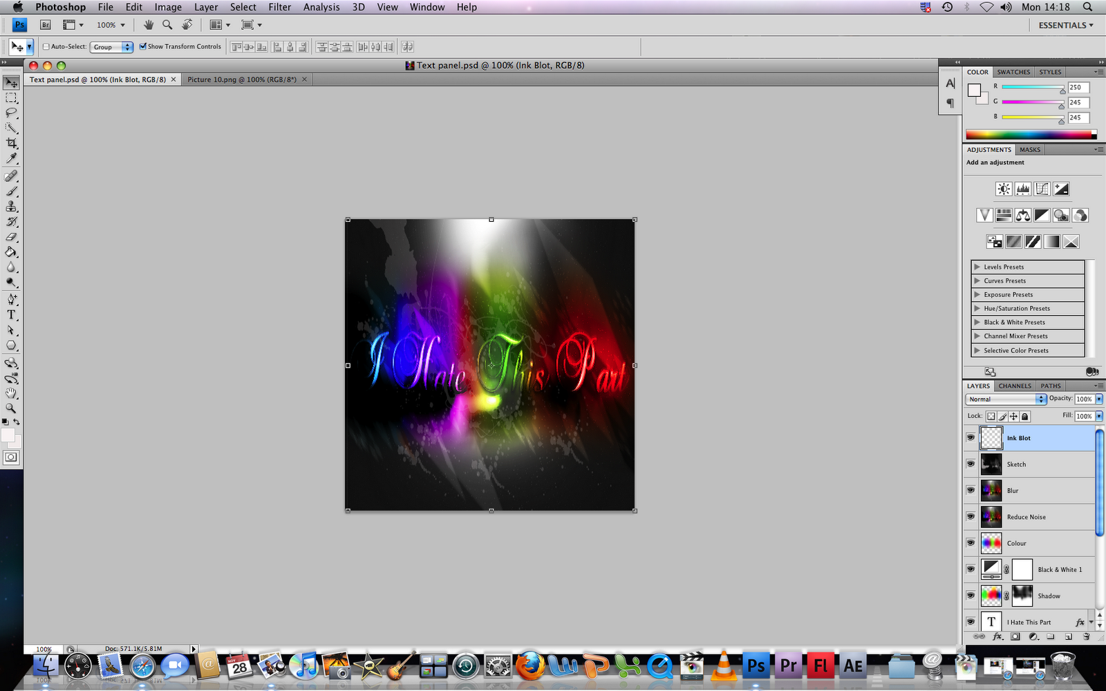
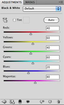
We decided that for our second inside panel, we wanted to design half the section whereby we took a lyric from the song that appeared in our music video "Hate This Part" and print this across the center of the panel, blending in bright neon colours using shadows and tones to create a really vibrant, pulsating and exciting panel which would appeal more to the younger end of our target audience that being people aged between 13-17 and would just really stand out and make our digipack appear to look vivacious and alive. We also used a mini spotlight to add brightness to the panel and to really help the text stand out brightly. Below is a step by step for how we created this panel.


Sunday, 27 November 2011

Record Label Logo:

Below is the record label logo that we created for our record company 'Interscope Records.' The companies logo will be showcased on the back cover of our digpack album. We realised that to create a successful back cover for an album it is often good to observe and look closely at the coventions within a digipack back cover. We found that on most digipack albums the record company logo was usually situatuated on the bottom right hand corner of the panel, so we decided that this would probably be the best place to display ours as well. The logo was created on photoshop by using the inner and outer glows on the text toolbar in order to create an attention grabbing and proffessional, unique logo for our artists back cover.


Thursday, 24 November 2011

Final Back Cover:

We decided that we wanted our back cover to display quite a grown up and sophisticated look for the digipack. We came to this decision for the reason that the majority of the album showcases a galactic, fun, brightly coloured style for each of the panels of the album and we thought rather than make the back cover the same as the rest of the panels we thought we'd mix it up a bit and use a simple, yet effective photo of the artist playing on the piano along with the names of the artists songs which will be appearing on the album printed onto the each key on the piano in bright white caligraphy.


- Feedback:
  • The concept of the cover is very creatively thought out and it is nice how you have listed as all the tracks on each key of the piano. It is a clear distinction that this is a power ballad and in the R&B genre. 
  • The use of the piano is well accomplished, however there is a empty space which could have been changed as overall its too black. 
  • The instrument creates a main focus of the back and it suggests a possible iconography of the artist . All conventions which are on the back cover have made a very clean and professional cover. However the barcode and websites seem quite cramped.
After looking over the feedback, we decided to add colour to certain corners and areas of the panel in order to create a less empty feeling within the shot. Additionally, the use of tones and colours that have now been added to the panel clearly fit the style of our digipack. Located below is the final back cover that we have created for our artists digipack.

Part 1 Inside Panel:

We decided that for our second inside panel (where our CD/DVD would be fitted) in the digipack we would split the panel into two sections, the first section showcasing a lyric from the song which our music video is based on which would be coloured in different sections and would have different shapes and layers incorporated onto it, allowing the panel to depict a fun and vibrant style for the album. The second section of the panel would showcase half of the artists body, merely showing her face and shoulders with another lyric from 'Hate This Part' printed across the artists hat.

We decided that for this panel we wanted to really bring out the contrast and vibrance levels in this photo in order to make the artist stand out clearly to her fans whilst creating this edgier, fun style for the album. Below are screengrabs showing our step by step instructions for how we created this panel.


Feedback: 
- I like the colour of the digipack, the glow. I like the effect on the hat, whereby there are a mixture of different colours contrasted together. I also like the lyrics that are placed on top of the singer and are showcased across the singers hat. (Feedback given by male aged 17)

- The shot itself is quite good as you can see the artist. The mise-en-scene is spot on, the hat represents the image of a singer/songwriter. I'd scale back the effects, it seems to tampered with, if you strip it back because it is the first album because the fans need to know the artist before they start distorting the image. (Feedback given by male aged 17)

- Perhaps change the clarity of it, not very clear. Don't like the text, not very clear either. I like the picture effect thats been used. (Feedback given by male aged 17.)

- The writing looks unclear, looks a bit blurry. I like the vibrance effect looks good and I like the way the artist is looking down and the hat is slightly covering the artists face. (Feedback given by male aged 17.) 


Monday, 21 November 2011

Progress of the first inside panel of the digipack:

After researching and looking at previous digipacks designed specificaly for R&B artists such as Rihanna, Christina Aguilera, Beyonce and so on, we noticed that one major convention which constantly appeared in the inside of their digipacks was that there was always a photograph of the artist posing for the camera. Evidently, this had been incorporated into the digipack in order for the artist's fans to be able to see the artist and have a photo of the person that they looked up to and loved. With this in mind, we decided to do a similar thing and take a photograph of our artist and use this as one of our inside panels for our digipack.

Our first idea, was to change the vibrance and contrast tools in order to make the artist stand out more and look a lot more eye catching and vibrant, we then decided to fill the background in a black colour in order to blend in with our digipack panels and a way of allowing the artist to be the only colourful feature which would stand out for the fans. We then decided to add a bright white spotlight to the panel so that this would eccentuate and highlight the artists features and would make her appear more noticeable on the panel. Below is a quick step by step of how we created the first inside panel for our digipack.


However, we decided that the spotlight's on the panel were two bright and slightly overpowered the image of our artist which wasn't the look that we were going for. We attempted to darken the spotlight so that it would only add a bit of light to the image, but sadly it made no difference to the photo so we had to resort to getting rid of the spotlight altogether. We decided that another possible effect which could be used for this panel was to just simply keep the black background and the image of the artist but this time bring out the vibrance and contrast levels even more in order to make the artist stand out and appear bolder and brighter. This is showcased below.


Rough Ideas for Front Cover of Digipack:

This was a panel that we created as a possible front cover for our artist's digipack album. However, we realised that from editing the image and playing around with the Photoshop tools we noticed that the style of the image which we had created for our panel, looked to boring and the shot looked like a standard photoshoot photograph which wasn't the look that we were going for. We came to the conclusion that it was simply too plain and would not have grabbed our fans attentions as a front cover for an album so we decided to dispose of this idea.


Digipack Front Cover Progress:

Both Khushel and I decided that a way in which we could make the front cover appear far more appealing and attention grabbing for our fans would be to perhaps change the aesthetics of the panel which would mean changing the background of the image to enhance the artist's appearance, making her seem more noticeable on the front cover. We did this by firstly changing the colour of the females top to black and white rather than the original yellow and blue top that it was beforehand and adjusting the vibrance and contrasting colours in order to make the photograph of the artist stand out more and grab hold of her audiences attention. We also decided to add some colour to the text, something that would allow this to stand out on the front of the panel also, so we opted for a bright gold colour.


After recieving feedback from our class, we were told that whilst the overall image was good, they thought that the colour of the title looked a bit out of place as it did not match anything that was orignally placed on the front cover. We were told that a way of improving this would be to perhaps change the colour of the text from gold to a pale pinky colour, one which closely matched the artists skin tone, as her skin is exposed quite a bit in the image. Below are the images that we screengrabbed showing how we changed the colour to match the artists skin tone and the final panel showcasing this. 


We also decided that we would change the front cover entirely by changing the vibrance and constrast tools on 'photoshop' to black and white in order to make the panel appear more appealing and attention grabbing to our fans. We came to this conclusion due to the fact that the front cover came across as more of a poster format rather than an album cover.  


However, after all our efforts to try and make the front cover look like an album cover we realised that no matter what colours or format or contrast changes we made to the image, nothing stopped it from looking like a poster. When showing these panels to our class they also agreed with us and stated that there was "something missing from it" so we came to the decision to re-do our front cover for our album, this time making it more bolder, brighter and better. 

Monday, 3 October 2011

Digipak Research:

I have decided to analyse each of these digipack albums for the reason that I am hoping to gain ideas when creating and commencing my own design for my artists digipack album covers. Below are the three digipack albums I found on the internet that represent the genre of music that our artist fits into, that is, R&B. The artists we chose, "Beyonce, Christina Aguilera and Rihanna" are all R&B artists, so by researching and looking into their digipack albums we realised that this would help us a lot when wanting to design our digipack album so that it would fit accordingly into the R&B genre.

Beyonce's Digipak

Christina Aguilera Digipak
 Rihanna Digipak

Although I like this particular format for the digipack album, both Khushel and I have decided to create a DVD digipak as we both prefer this type of format as the CD format looks like it is too squashed down and it can be quite difficult to read the text.


I have also attached my first inital idea drawings that I sketched out as a possible digipack for my artists album cover. When designing this digipack I took notes from the digipacks showcased above when creating my own one. One of the things I noticed with the albums above is that in each of them there was always a photograph of the artist posing in somesort and this was usually inputted onto one of the inside panels, so I sketched out an image of the artist holding a microphone and posing to the camera in order for her to promote herself on the album. The inital ideas of my digipack are depicted below.

Whole of Digipack:

Front Cover of Digipack

First Inside Panel of Digipack

CD for Album (Second Panel of Digipack)

Back Cover of Digipack