BLOGGER TEMPLATES AND TWITTER BACKGROUNDS

Monday 28 November 2011

Final Front Cover:


Located above is the front cover that both Khushel and I decided would be the most appropriate and eye catching front cover for our digipack album. The colours gradually bring out the image of the artist without looking too washed out. However, there are far too many dark patches on the face of the artist so these will be smoothed out. To change this I decided to duplicate the original image in order to enhance the artists face and to create a presence within the video. I used the clone tool in order to match the facial skin tone to the dark patches on the digipack cover.


I also changed the font in order to keep it within the theme of calligraphy, this led to the positioning and resizing of the text in order to enhances the artist. I researched previous digipack albums, looking specifiically at whether the artists name was bigger than the album name. I found out that this was the case in most of the R&B genre album covers.

Final Inside Panel:

We came to the decision that after using the spotlight effect and incorporating the plain black background effect onto our first inside panel we realised that there was still something missing from it and it definitely looked far to plain and boring. There wasn't anything to it and for me it didn't engange or grab my attention. I decided to dispose of the black background idea and inport a multi coloured background onto the back of the panel before adding a black background on top of this, as a cover.

I then used one of the large paint splash effect and brush to make marks in the black backdrop allowing the bright colours behind this to come through. After we contrasted and blended the mix of colours together both Khushel and I agreed that this panel looked a lot better and undoubtedly more professional as it looked increasingly fun, animated and exciting which again, matched with the style of our digipack.


Newer Text Image for inside panel:

After receiving some feedback from our peers, we were told that the bright colours that were used as shadowed effects on top of our text looked to messy and bright, as if they'd just been put there for the sake of it. They also said that the bright colours made it quite hard to read the text as well and stopped the text from appearing as the main focus point on the panel which was what it was meant to appear as.

So, Khushel and I decided to use one of the paint brushes to erase some of the colour out of the text so that it only appeared towards the bottom of it. We agreed that after removing some of the colour it clearly made this panel look more effective, vibrant and professional whilst still showcasing the style of our digipack. The step by step of how I fixed this panel and the feedback I recieved from my peers is displayed below.


Feedback:

- It's less colourful, it's not too in your face now compared to before which makes the image a lot better. (Feedback given by male aged 17.)

- The one before was too full on and you couldn't read the writing, and the focus was mainly on the colour before rather than the writing, which wasn't good because it was the writing we wanted to see. 
By diluting the colour it definitely makes the panel more interesting and appealing. Good panel. (Feedback given by male aged 18.)

- By diluting the colour the background is more noticeable which is good. I like the yellow in the middle and it's definitely better than the old one because the colours are faded out. Looks a lot more professional. (Feedback given by male aged 17)


Possible inside panel for digipack:

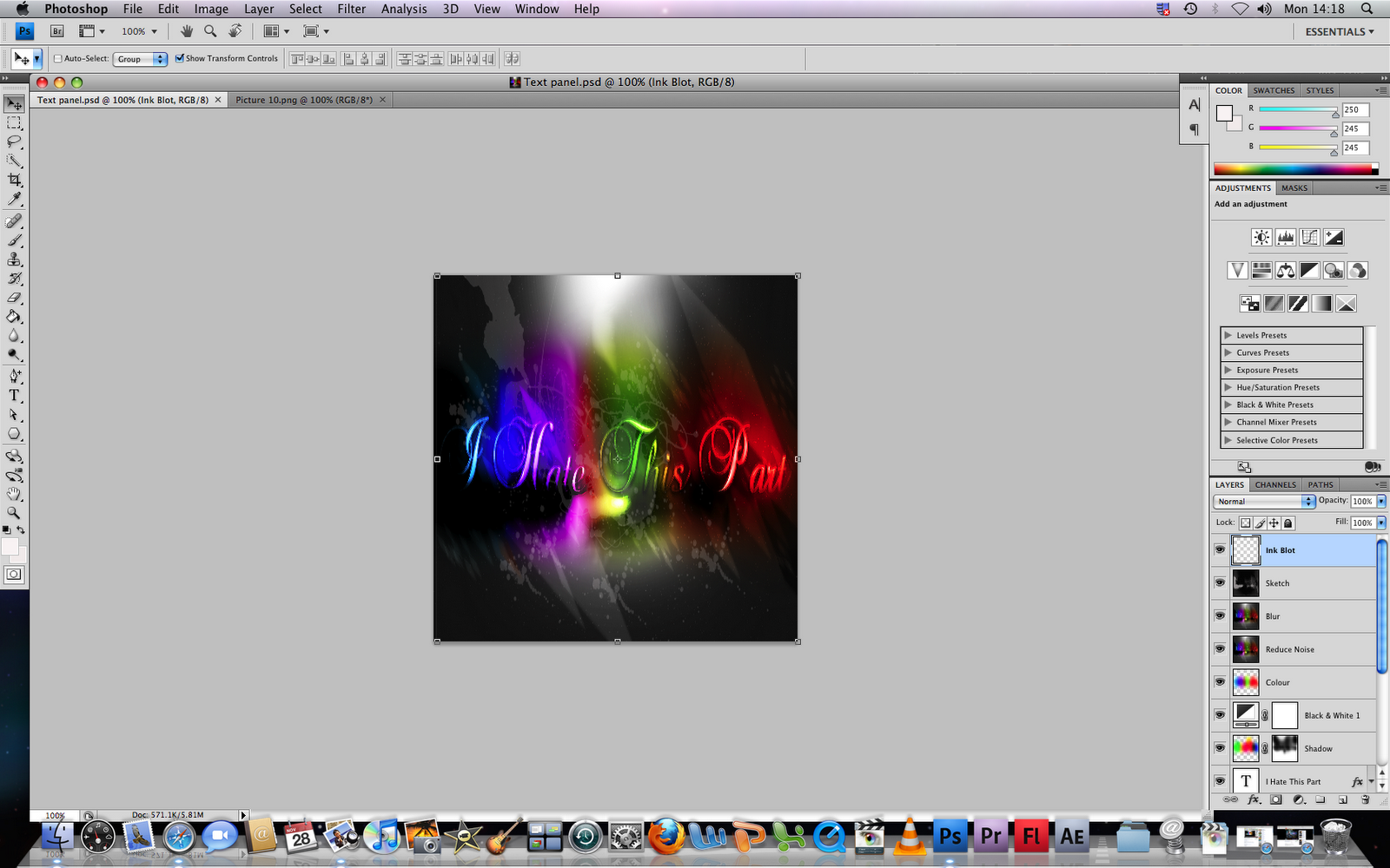
After creating both of the sections for our second inside panel for our digipack we decided to fit the panel to size so that it would fit the measurements for our DVD digipack album. We also wanted to be able to see what the overall panel would look like by attaching both of the sections of the panel together. Presented below is the step by step for how we attached both sections of the panel together along with the feedback we recieved from our peers.


Feedback:

- I like the design, the font and the background. I like the black and white. I don't like the purple, green, blue background colours looks a bit childlike. Perhaps, darken the colours more. But I like the background and font of it. (Feedback given by male aged 17)

- Both pictures look good in a unique way but together maybe not so good. Can't really see the text. (Feedback given by male aged 17.)

- I don't like the whole rainbow thing on the top half of the panel. Picture of the hat has been saturated a bit to much. I like the attention to detail with the hat and the covering of the eyes and with the hand holding the hat. (Feedback given by male aged 17)

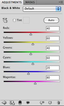
However, after reviewing all of the feedback given from our peers, we decided to change the background and the colour of our text as the white background was far too contrasting with the rest of our panels. Moreover, after placing the two sections for the second panel of our digipack together, both Khushel and I realised that the panels didn't match up very well together, as one panel was dark with bright neon colours painted across half of it, whilst the other was coloured white with a very bright, high contrasted photograph in the centre.

For us, we realised that it didn't look professional or sleek but a bit of a mess sadly, so we decided to change the bottom section of the panel which showcased the photo of the artist with the lyric from our song stamped across the artists hat by changing the background to black and adding a mix of colours to the panel so that the photo matched the style of our digipack, that is, a galactic and more vibrant theme which will hopefully cater for our audience and what's more, with any luck it should match the top section of our second inside panel.

We then showed our class the new layout for the panel where they all agreed that it looked far more appealing, fun and clearly matched the style of our digipack.


2nd Part of Inside Panel for Digipack:

We decided that for our second inside panel, we wanted to design half the section whereby we took a lyric from the song that appeared in our music video "Hate This Part" and print this across the center of the panel, blending in bright neon colours using shadows and tones to create a really vibrant, pulsating and exciting panel which would appeal more to the younger end of our target audience that being people aged between 13-17 and would just really stand out and make our digipack appear to look vivacious and alive. We also used a mini spotlight to add brightness to the panel and to really help the text stand out brightly. Below is a step by step for how we created this panel.


Sunday 27 November 2011

Vernallis Analysis: Lady Antebellum "Need You Now."

Vernallis Analysis:

Lady Antebellum’s music video ‘Need You Now’ has played a major part in inspiring us for narrative concepts for our own production for our music video ‘Hate this part right here.’ We have taken notice of some of the narrative concepts in this video such as the bedroom and hallway scenes, with the one member of the couple locked inside her bedroom whilst the other is sat outside a bedroom door and the taxi scene, in order to create a perfect narrative story for our video.


Narrative:
The first narrative concept that is showcased in the video is set in a hotel corridor and bedroom whereby the male protagonist is depicted on his phone looking saddened as he sits outside a hotel bedroom door whilst the female protagonist is illustrated sitting inside the bedroom looking deeply hurt.


 Whilst the male is seen talking on his phone, the camera automatically changes to a close up of a blackberry ringing on the bed inside the bedroom, suggesting that perhaps it is this female protagonist who the male character is attempting to get into contact with.


The lyrics and visuals harmonize with each other as both the female and male protagonists sing about the pain their suffering from and feeling in their relationships, for example, “I guess I’d rather hurt than feel nothing at all.”

There are many extreme close ups of the male where he wipes his hand across his face looking deeply hurt and shaking his head as if I thinking I can’t take this pain any longer, whilst the female protagonist is depicted lying in bed laying her hand just above her heart, perhaps suggesting that she is heart broken.


The narrative then changes to the male protagonist sitting inside of a coffee shop whereby he continues to sing as he looks at other happier couples enjoying themselves, perhaps thinking to himself, If only that was me - being in a happy, loving relationship. The camera then focuses on the female protagonist sitting inside of a taxi singing whilst staring out at the window looking as though she is tired of feeling hurt and heart broken and wants to feel loved again.


Suddenly, the narrative changes and we watch as the male protagonist runs out of the coffee shop down the street and runs into a hotel whereby a party is being hosted.


We then see the female protagonist running into the same hotel entrance where she runs into the same party. The narrative is trying to make the audience think about what is going to occur in the subsequent scene, perhaps the couple have run into the same hotel party trying to find each other.


However, as the narrative storyline comes to an end we discover that actually the male protagonist in the video had run to the party to find another girl who he was meant to be with and the female protagonist ended up running to find another man at the party who she was meant to be with also. We discovered that both the female and male protagonist had different other halves which were not each other; they were merely singing the same song about how they felt.


Throughout the last section of the narrative, there are many jump cuts which are inserted into the video, that is, close ups of the female protagonist singing staring straight into the camera and close ups of the male protagonist also singing staring straight towards the camera, exemplifying their emotions and reactions about the pain and hurt they are feeling in each of their relationships.


This video clearly highlights Vernallis’s four key concepts that all relate to the way the music video is constructed. Evidently, the narrative definitely consists of a visual response towards the music as the visuals clearly emphasize the mood of the song, for instance, close ups of the singer as she is seated in the back of the dark lit taxi looking down shows us that she is in a lot of pain and the tone of the music harmonizes with these scenes.

Vernallis also states that there is not necessarily a balance between the narrative and performance concepts which is true for this video, as there is predominately more narrative in the video compared to performance. The only performance included in the video is the close ups of the female and male protagonists when they sing staring into the camera.

Editing:
This music video is like many others; it has all the same conventions as most other videos such as it doesn’t follow the rules of continuity and consists of many jump cuts, cutting within the lyrics and so on. However, this doesn’t stop the video from looking professional and well put together, as the change in shots do match the beat of the song and each of the scenes flow into one another exceptionally graceful and well. The video does consist of very sharp editing and does often show some continuity between scenes but the most noticeable editing skill in the video is that the scenes always knows to change if ever the beat of the song changes also, clearly harmonizing together very well.

Camera, Movement and Framing:
Vernallis claims that when it comes to shot types in the video there are often many extreme close ups that are very common, this is true for this music video as they are a vast amount of close ups used in the video, between performance close ups of the singer and close ups of the couple looking upset and showing their reactions about the pain they are feeling due to the breakdown of their relationship. These close up shots also exaggerate the artist’s iconography which is often depicted in many music videos.

The camera moves in time with both the beat of the music and often moves on the lyrics. The framing of the music video is often filmed in the centre, yet some of the close ups are framed slightly to the left or right hand side of the frame which becomes distinctive throughout the music video.


Diegesis:
This diegesis is revealed quite slowly in the music video, and there are many repetitions of the diegesis throughout the video, such as the repetition of the bedroom and hotel hallway scenes and the repetition of many close ups of the female and male protagonist looking heart broken and upset and there is sometimes a gap in the audiences understanding of the diegesis – in performance and narrative, whereby the narrative continues to flow throughout the video but does consist of some interruptions where a performance takes place whereby the female and male protagonist begin to stare into the camera singing.


Record Label Logo:

Below is the record label logo that we created for our record company 'Interscope Records.' The companies logo will be showcased on the back cover of our digpack album. We realised that to create a successful back cover for an album it is often good to observe and look closely at the coventions within a digipack back cover. We found that on most digipack albums the record company logo was usually situatuated on the bottom right hand corner of the panel, so we decided that this would probably be the best place to display ours as well. The logo was created on photoshop by using the inner and outer glows on the text toolbar in order to create an attention grabbing and proffessional, unique logo for our artists back cover.


Thursday 24 November 2011

Final Back Cover:

We decided that we wanted our back cover to display quite a grown up and sophisticated look for the digipack. We came to this decision for the reason that the majority of the album showcases a galactic, fun, brightly coloured style for each of the panels of the album and we thought rather than make the back cover the same as the rest of the panels we thought we'd mix it up a bit and use a simple, yet effective photo of the artist playing on the piano along with the names of the artists songs which will be appearing on the album printed onto the each key on the piano in bright white caligraphy.


- Feedback:
  • The concept of the cover is very creatively thought out and it is nice how you have listed as all the tracks on each key of the piano. It is a clear distinction that this is a power ballad and in the R&B genre. 
  • The use of the piano is well accomplished, however there is a empty space which could have been changed as overall its too black. 
  • The instrument creates a main focus of the back and it suggests a possible iconography of the artist . All conventions which are on the back cover have made a very clean and professional cover. However the barcode and websites seem quite cramped.
After looking over the feedback, we decided to add colour to certain corners and areas of the panel in order to create a less empty feeling within the shot. Additionally, the use of tones and colours that have now been added to the panel clearly fit the style of our digipack. Located below is the final back cover that we have created for our artists digipack.

Part 1 Inside Panel:

We decided that for our second inside panel (where our CD/DVD would be fitted) in the digipack we would split the panel into two sections, the first section showcasing a lyric from the song which our music video is based on which would be coloured in different sections and would have different shapes and layers incorporated onto it, allowing the panel to depict a fun and vibrant style for the album. The second section of the panel would showcase half of the artists body, merely showing her face and shoulders with another lyric from 'Hate This Part' printed across the artists hat.

We decided that for this panel we wanted to really bring out the contrast and vibrance levels in this photo in order to make the artist stand out clearly to her fans whilst creating this edgier, fun style for the album. Below are screengrabs showing our step by step instructions for how we created this panel.


Feedback: 
- I like the colour of the digipack, the glow. I like the effect on the hat, whereby there are a mixture of different colours contrasted together. I also like the lyrics that are placed on top of the singer and are showcased across the singers hat. (Feedback given by male aged 17)

- The shot itself is quite good as you can see the artist. The mise-en-scene is spot on, the hat represents the image of a singer/songwriter. I'd scale back the effects, it seems to tampered with, if you strip it back because it is the first album because the fans need to know the artist before they start distorting the image. (Feedback given by male aged 17)

- Perhaps change the clarity of it, not very clear. Don't like the text, not very clear either. I like the picture effect thats been used. (Feedback given by male aged 17.)

- The writing looks unclear, looks a bit blurry. I like the vibrance effect looks good and I like the way the artist is looking down and the hat is slightly covering the artists face. (Feedback given by male aged 17.)