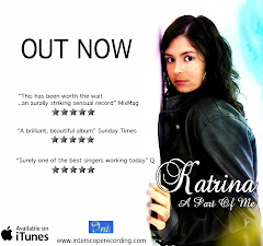
So, Khushel and I decided to use one of the paint brushes to erase some of the colour out of the text so that it only appeared towards the bottom of it. We agreed that after removing some of the colour it clearly made this panel look more effective, vibrant and professional whilst still showcasing the style of our digipack. The step by step of how I fixed this panel and the feedback I recieved from my peers is displayed below.


Feedback:
- It's less colourful, it's not too in your face now compared to before which makes the image a lot better. (Feedback given by male aged 17.)
- The one before was too full on and you couldn't read the writing, and the focus was mainly on the colour before rather than the writing, which wasn't good because it was the writing we wanted to see.
By diluting the colour it definitely makes the panel more interesting and appealing. Good panel. (Feedback given by male aged 18.)
- By diluting the colour the background is more noticeable which is good. I like the yellow in the middle and it's definitely better than the old one because the colours are faded out. Looks a lot more professional. (Feedback given by male aged 17)


No comments:
Post a Comment