Monday, 28 November 2011
2nd Part of Inside Panel for Digipack:
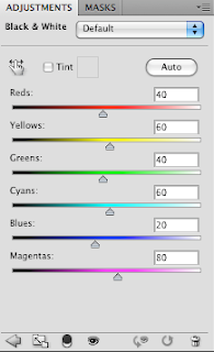
We decided that for our second inside panel, we wanted to design half the section whereby we took a lyric from the song that appeared in our music video "Hate This Part" and print this across the center of the panel, blending in bright neon colours using shadows and tones to create a really vibrant, pulsating and exciting panel which would appeal more to the younger end of our target audience that being people aged between 13-17 and would just really stand out and make our digipack appear to look vivacious and alive. We also used a mini spotlight to add brightness to the panel and to really help the text stand out brightly. Below is a step by step for how we created this panel.
Labels:
Digipack:,
Initial Ideas
Subscribe to:
Post Comments (Atom)


No comments:
Post a Comment